Opheliaai промпт:Please turn each European architectural travel photo I upload into an independen…
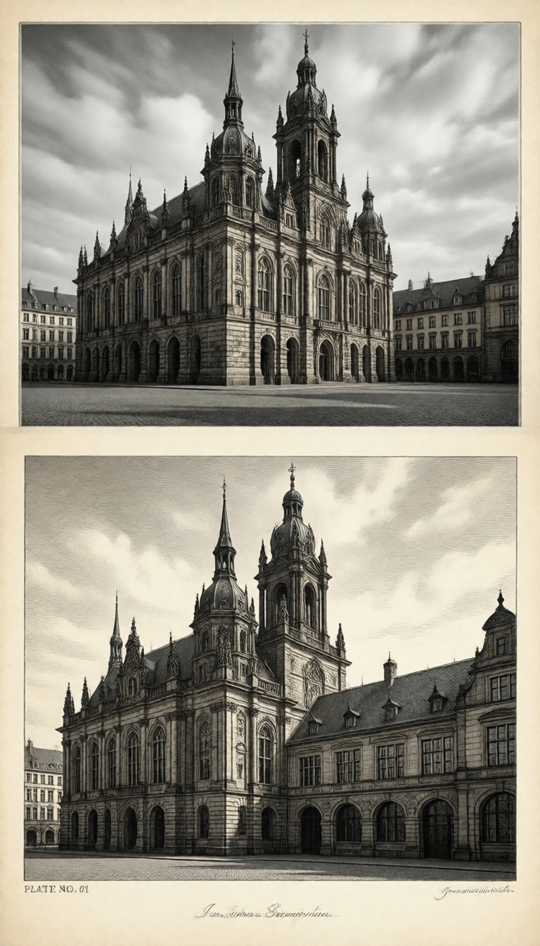
Please turn each European architectural travel photo I upload into an independent high-end monochrome architectural etching comparison poster, not a multi-image collage, with each photo output separately. The overall composition uses a 3:4 vertical layout, forming a clear but natural contrast between the original image and the converted drawing above and below. The two areas usually account for about 50% each, which can be slightly adjusted according to the proportions of the original subject, but the contrast relationship of the original image must not be canceled. The upper part preserves the original photo with high fidelity. Maintain the architectural identity, main structure, real materials, perspective relationship, natural lighting, environmental scale, and original color atmosphere, only performing slight high-end photographic color grading to give it the texture of architectural magazines, independent publications, and exhibition photography. To adapt to the frame, the sky, ground, or environmental background can be naturally extended, but the main architectural body must not be stretched, distorted, replaced, or changed at will. The lower part extracts the most recognizable outlines, structures, and spatial relationships of the building from the original photo, reconfiguring them into a monochrome copperplate etching or classical architectural print. Do not directly replace the entire photo with a line drawing, nor mechanically copy the composition of the upper part; the scale, cropping, and position should be reselected according to the architectural features. Arches, spires, domes, colonnades, or gables can be enlarged, or a continuous facade can be compressed into a horizontal rhythm, making the lower part an edited and refined independent plate, while still being able to recognize the original building at a glance. Use extremely fine etching lines, parallel hatching, cross-hatching, stippling, broken lines, and a small amount of drypoint scratches to shape stone, brick walls, carvings, window panes, metal roofs, and spatial shadows. Foreground structures are clear, and dark areas are established through line density rather than large blocks of pure black; background, air, sky, and screen edges gradually reduce lines and stippling, naturally dissipating into the paper, avoiding hard rectangular borders and complete photo outlines. The lower part uses warm ivory white, natural cream, or slightly aged paper backgrounds, retaining about 35%—55% continuous paper white. The subject is prioritized in the middle and lower parts, leaving breathable empty space around it. The paper has restrained and realistic fibers, tiny indentations, and plate pressure, but do not make it look like dirty old kraft paper or use excessive retro filters. Only one ink color and its lightness variations are allowed for each work. The ink color is adaptively selected according to the temperament of the original image from deep indigo, Prussian blue, blue-gray, charcoal ink, or warm dark sepia, but multiple color inks must not be mixed in the same work. Establish volume, distance, and light through variations in the thickness, density, overlap, and ink starvation of lines of the same color. Refine a 1—3 word English title based on the location, architectural type, morphology, or travel feelings in the photo, and add a plate number in the form of "PLATE NO. 01" and a 5—10 word English observation sentence. The text uses narrow uppercase serif fonts or old topographical movable type in the same color as the print, clearly readable with slight ink starvation and paper tooth; placed in the continuous white space, forming a sparse and restrained publication layout with the main building. Do not have garbled characters, meaningless long text, or large areas of text that grab the subject. Overall reference classical copperplate etching, European urban topography, museum architectural plates, old architectural survey books, and contemporary high-end editorial design, presenting a precise, quiet, rational visual temperament with a sense of collectability and real printing touch. Avoid simple black and white filters, pencil sketches, watercolors, gouache, comic ink lines, CAD blueprints, pure vector line art, screen-tone dots, multi-color printing, hard photo outlines, full-page coverage without white space, hard rectangular illustration frames, 3D rendering, plastic feel, e-commerce feel, and template feel.